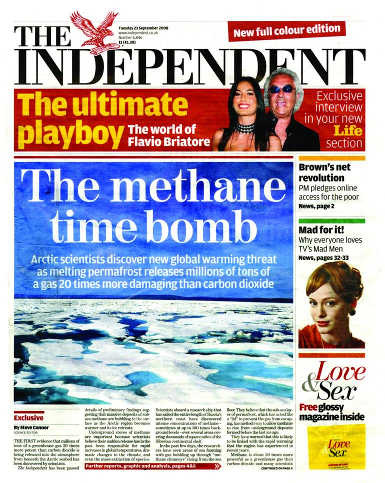
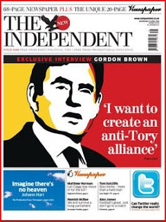
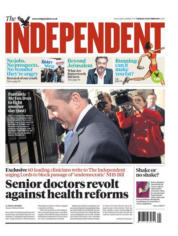
 If you don’t like today’s redesign of The Independent, don’t worry. History suggests there’ll be another one along soon enough.
By most counts this is the fifth time in as many years that the title has put on a fresh set of clothes in a bid to change its fortunes. That’s roughly the same rate that Chelsea appoints new managers.
On the one hand I’m annoyed because it means I have to produce yet another set of Indy-style templates for our student’s news days.
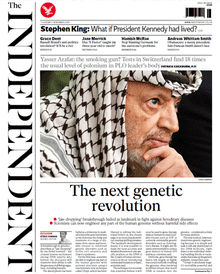
But actually, I rather like this new look for a number of reasons:
Overall, I think the new Indy has a classier feel, and the design allows it to make more of its dwindling resources.
A redesign will never, in itself, transform the fortunes of a newspaper (although the Indy’s change of format from broadsheet to compact in 2003 did give it a spectacular short-term boost). Existing readers either don’t notice, or get grumpy about things like the crossword moving.
New readers are only likely to arrive if there is a massive marketing push to back it up – or a price reduction to undercut the opposition. With The Times still 40p per day cheaper, I doubt we’ll see much of a dramatic shift in ABC figures – however well received this particular revamp proves to be with readers.